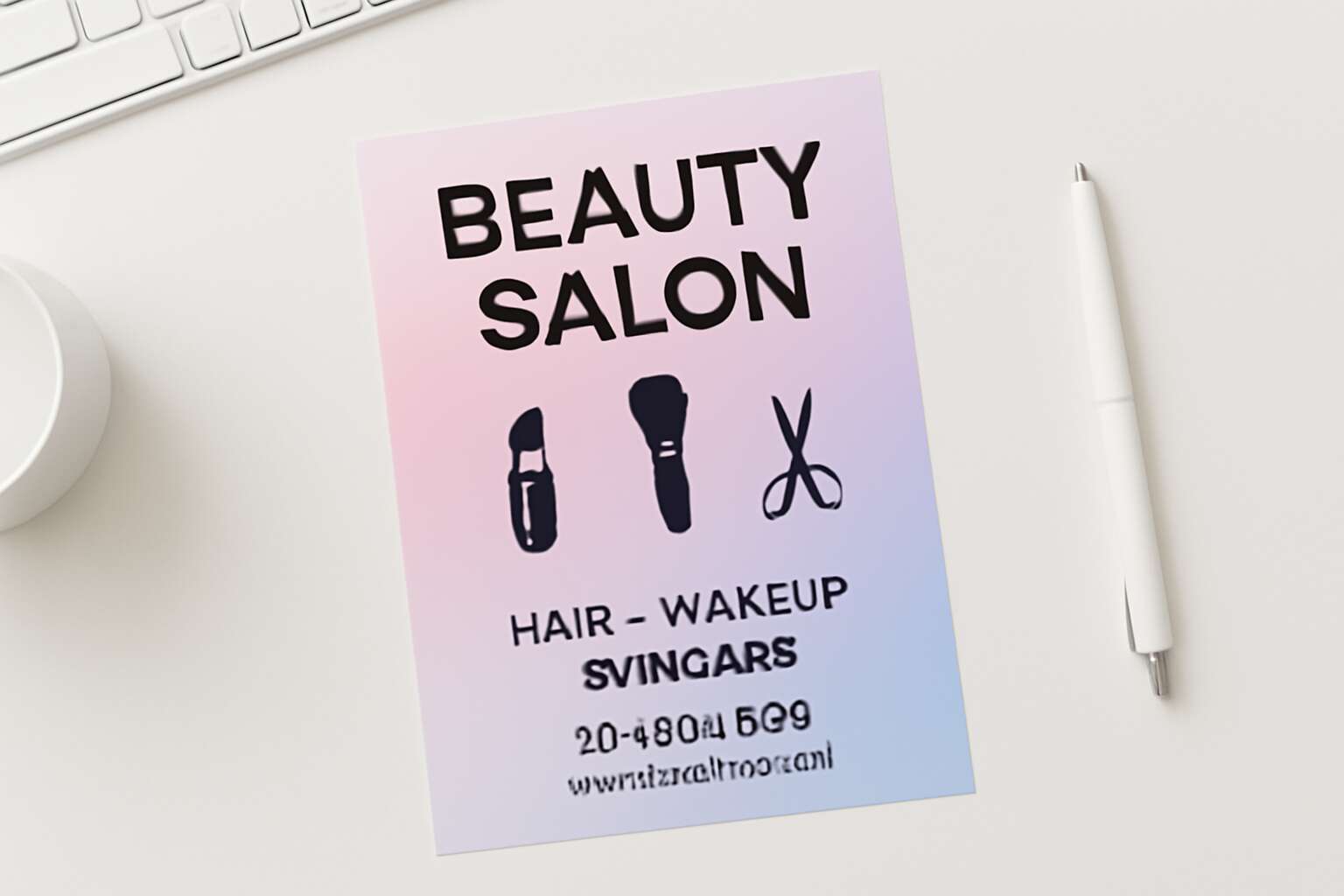
Visual Language and Layout Principles for Beauty Salon Flyers
Branding alignment: color palettes, typography, and logo usage
Smart, calm, and instantly legible—these are the hallmarks of beauty salon flyer design. In South Africa, a flyer has three seconds to land a booking, so the visual language must speak quickly. Alignment of color, typography, and logo usage tells a clear brand story without shouting.
Color palettes should reflect mood and service tiers, guiding eyes toward key offers. The palette must perform in print and online, from storefront posters to social squares.
- Warm neutrals with metallics for premium looks
- Soft pastels with bold accents to signal spa-friendly spaces
- High-contrast combos like charcoal and white for legibility and luxury
Typography choices should be legible from a distance and on small screens. A single display face for headlines paired with a simple body type keeps the message clear. Logo usage follows a consistent clear space and proportional scaling across materials, from posters to business cards.
Layout anatomy: grid systems, focal points, and white space
Three seconds to land a booking—that’s the tempo SA storefronts live by. Visual language for beauty salon flyers must speak quickly, clearly, and with a touch of elegance. This is beauty salon flyer design in motion: grid systems, focal points, and white space choreograph the eye so the brand story lands without shouting.
- Grid systems create a predictable rhythm that guides scanning.
- Focal points pull attention to the offers that matter most.
- White space ensures legibility across posters and screens.
Across storefront posters, brochures, and social squares, the language must remain legible and poised. When the grid breathes and the eye moves through space with intention, the audience is nudged toward the offers without interruption—an artful balance South Africa’s beauty scene respects.
Copywriting for promotional impact: headlines, CTAs, and benefits
Three seconds to land a booking—the tempo that guides beauty salon flyer design in today’s crowded SA streets. The visual language must read fast, feel refined, and whisper a clear promise of pampering. It’s about legible type, a calm color note, and white space that lets the brand breathe, whether you’re on a poster or a feed.
Headlines cut straight to the payoff: what you offer and why it matters, now. This is why beauty salon flyer design matters: it anchors the reader in minutes, guiding the eye to the offer and the CTA. Pair them with CTAs that feel like invitations rather than sales push—Book now, explore services, or reserve your slot—with benefits stated nearby: quick treatments, radiant skin, or a moment of indulgence.
In SA, the payoff is clarity. A well-crafted layout keeps the reader moving with intention, fits posters and screens, and nudges bookings without shouting.
Imagery strategy: photography, stock vs original, and image licensing
Three seconds to stop the scroll—that’s the tempo of SA beauty spaces, where a single frame can cue a booking. Visual language should read fast yet feel refined: candid photography that hints at pampering, a calm color whisper, and white space that lets your brand breathe. For imagery strategy, mood travels through every pixel, from lighting to tone, and it feeds into beauty salon flyer design.
- Original shoots deliver texture and personality, weaving a story clients feel in their bones
- Stock imagery can fill gaps when licensed for commercial use and aligned with your tone
- Licensing clarity protects posters and social feeds alike, preventing unexpected reprints
In SA rooms and on city walls, photography must travel across posters and feeds without losing warmth. I watch as light folds over a freckled shoulder, and beauty salon flyer design becomes a quiet invitation to indulge.
Audience-Centric Messaging and Value Proposition for Salon Promotions
Persona-driven messaging: tailoring offers to core clients
A tailored message can lift bookings by up to 20%, and in South Africa, clients crave messages that feel personal. When a flyer seems written for them, the choice to book becomes almost inevitable. Audience-centric messaging transforms a simple promo into a memorable moment.
Consider three core client personas that keep a salon thriving:
- Busy professionals who want a quick spruce during lunch
- Weekend pamper seekers chasing indulgence with friends
- Beauty enthusiasts hungry for the latest trends and treatments
Lead with a clear value proposition: convenience, confidence, and lasting glow. Your beauty salon flyer design should whisper to each segment with language they feel in their bones, turning interest into appointments and first-timers into regulars!
Highlighting unique selling points and limited-time offers
“A flyer is the handshake that lands before you speak,” a veteran marketer says, and it sticks. In South Africa, audience-centric messaging turns promos into moments of anticipation—convenience, confidence, and lasting glow as a promise you deliver, including limited-time offers that feel exclusive. Three core clients keep the doors busy: busy professionals, weekend pamper seekers, and beauty enthusiasts chasing the latest trends. The beauty salon flyer design is a whisper, not a shout—a lure that fits into life and lingers.
For each segment, the language should land softly, with a rhythm clients feel in their bones:
- Convenience that respects busy lives
- Confidence through consistent results
- Lasting glow that keeps conversation going
That trio anchors the beauty salon flyer design, guiding visuals and wording to feel tailor-made rather than generic—turning curiosity into regulars!
Messaging hierarchy and CTA placement for conversions
“A flyer is the handshake that lands before you speak,” a veteran marketer says. In South Africa, audience-centric messaging turns promos into moments of anticipation, where convenience, confidence, and lasting glow linger as promises rather than pitches. Three core clients keep the doors busy; beauty becomes a whisper that fits into life!
“In beauty salon flyer design, clarity guides the eye and trust guides the choice.” The value proposition speaks to reality, then teases outcomes. I’ve seen the hierarchy follow the audience: convenience for busy professionals, confidence from consistent results, lasting glow for conversations. CTAs sit with intent: a primary action above the fold and supportive prompts nearby.
- Position the strongest, segment-aligned benefit at the top to anchor attention.
- Pair that benefit with a concise, action-oriented phrase that nudges the next moment.
- Place the primary CTA above the fold, with secondary prompts along the reading path to sustain engagement.
Tone, voice, and brand storytelling for beauty services
Across South Africa’s fast-moving beauty scene, first impressions arrive in seven seconds. Audience-centric messaging reframes the flyer as a moment of anticipation, speaking to busy lives—commutes, meetings, and school runs—with a brand voice that feels like a trusted friend.
Beauty in this design centers on a single, credible value proposition. beauty salon flyer design channels reality and outcomes through concise copy and thoughtful imagery; when easy scheduling, proven results, and a subtle glow align, interest becomes intent.
- Seamless booking and flexible timings
- Consistent results you can trust
- Visible radiance that lingers
Tone and storytelling become the glue—an honest, sensory journey from first glance to afterglow. The SA reader sees themselves on the page, and the brand becomes a familiar voice guiding the next appointment rather than a sale.
Design Elements and Accessibility for Multi-Channel Marketing
Color psychology and contrast for readability
Color is memory in motion, and in a crowded feed, contrast is the handshake that invites you in. In South Africa, bold color paired with crisp typography outpace muted peers, a reminder that first glance is a contract. When we craft for beauty salon flyer design, mood, legibility, and the promise of a visit fuse into one elegant impression.
Color psychology guides emotion, and contrast guides the eye across multiple channels—from print handouts to mobile banners. The goal is serene readability without sacrificing drama.
- High-contrast text and backgrounds for legibility
- Scalable typography that works in print and on small screens
- Descriptive alt text for all images so stories read aloud
Rhythm, alignment, and a touch of brightness weave a design that travels well. When accessibility shapes the journey, the result feels both luxurious and inclusive, a portrait of a brand that knows its audience.
Typography: font pairing and legibility across sizes
A single letter, cast in light and shadow, can govern a gaze in a sunlit South African street. For beauty salon flyer design, typography must endure from palm-sized mobile banners to glossy print, while mood lingers like perfume in a quiet corridor of possibility.
In pairing fonts, a graceful sans for body copy and a tempered serif or display for headlines creates legibility across sizes without sacrificing atmosphere. Accessibility shapes the journey—contrast, line length, and readable spacing become the quiet spine of multi-channel marketing.
- Limit to two or three typefaces that harmonize.
- Use scalable units (em/rem) so sizes breathe across devices.
- Provide descriptive alt text for imagery to aid screen readers.
Rhythm, alignment, and a touch of brightness guide the eye across prints and screens, turning a fleeting glance into a remembered invitation. The cadence of edges and spaces carries the mood into every channel.
Visual hierarchy and scanning patterns
Across South Africa, first impressions for beauty services are formed in under two seconds—your beauty salon flyer design must answer with clarity and grace. Visual hierarchy nudges the eye from headline to CTA, while scanning patterns help readers glide across palm-sized banners and glossy print. Accessibility matters: high contrast, readable line length, and descriptive alt text for imagery aid screen readers across channels. Favor two to three typefaces and scalable units (em/rem) so sizes breathe in every locale.
- Visual hierarchy that guides eye movement
- High contrast with readable line length
- Descriptive alt text for imagery
Rhythm and alignment carry mood like a perfume through digital feeds and storefront collateral, turning glances into invitations. The design travels gracefully from mobile banners to posters, preserving tone and legibility while speaking to SA audiences with nuance and care.
Brand consistency across print, digital, and social assets
Two seconds. In South Africa, that is the heartbeat between glance and decision. The beauty salon flyer design must answer with clarity and grace across palm-sized banners, glossy posters, and the digital corners of social feeds, binding mood and message into one breath!
Design elements serve as a passport, carrying your brand from print to screen. A quiet grid, deliberate rhythm, and restrained framing keep the look cohesive across formats, letting imagery and type align as one—yet breathing enough space so the eye never tires.
For every reader, craft accessible experiences—images told in words, contrast that respects legibility, and navigable layouts that invite curiosity rather than clutter. Across print, digital, and social assets, brand consistency is the quiet current guiding SA audiences through the night toward your doors.
SEO, Distribution, and Performance Measurement for Salon Flyers
Local search signals and landing-page optimization for promotions
Footfall on a Saturday town stroll can feel like a whisper, yet 78% of local mobile searches lead to an offline purchase. This is the spell your brand needs. A beauty salon flyer design acts as a lantern, guiding hands from screen to chair, from promo to appointment!
SEO whispers as local search signals. Ensure landing-page optimization for promotions is tight: fast load, mobile-ready, local keywords, and consistent NAP. Claim your Google Business Profile, invite reviews, and embed trackable promo links. The aim: connect nearby salons to your promise across South Africa.
Distribution channels should mirror where clients dwell.
- In-store handouts with QR codes to the landing page
- Local partnerships at gyms and cafes
- Community displays at events
Performance measurement is the final judge. Track conversions, promo-code redemptions, and landing-page behavior with UTMs and analytics. The numbers reveal which street corners whisper success!
Print-to-digital integration: QR codes and trackable URLs
Footfall on a Saturday stroll may feel like a whisper, yet in SA towns a single scan can summon an appointment. A sharp beauty salon flyer design acts as a lantern, guiding hands from screen to chair and from promo to appointment. Pair print with a QR code and a trackable URL—the shadows retreat as data becomes direction!
Distributions should mirror where clients dwell, stitching offline touchpoints to online intent. Think visitor-friendly placements that invite a quick scan and a quick booking!
- In-store collateral with visible QR codes linking to promos
- Local partnerships at gyms, cafes, and boutique studios
- Community displays at events and markets
Performance measurement is the final judge: monitor scans, promo-code redemptions, and landing-page behavior with UTMs and analytics. The numbers reveal which corners whisper success and which campaigns fade!
Distribution strategies: in-store, mail, and community partnerships
A sharp beauty salon flyer design does more than ornament a counter; it triggers local search signals and guides the eye to action. In South Africa’s bustling towns, a well-structured flyer makes the booking path obvious, turning curiosity into appointments and whispers into footfall.
To align with SEO goals, distribution should meet clients where they live—on counters, in mailboxes, and through community intersections.
- In-store collateral with visible QR codes linking to promos
- Local partnerships at gyms, cafes, and boutique studios
- Community displays at events and markets
Performance measurement is the final judge: monitor scans, promo-code redemptions, and landing-page behavior with UTMs and analytics. The numbers reveal which corners whisper success and which campaigns fade!
Metrics and iterative testing: response rate, redemption, and attribution
In South Africa’s bustling towns, a single well-tuned flyer can turn curiosity into a booked appointment. The beauty salon flyer design does more than ornament a counter; it acts as a local signal, guiding eyes toward a seamless path to discovery and treatment.
To align with SEO goals, distribution should meet clients where they live—on counters, in mailboxes, and at gym studios and market corners. The beauty salon flyer design anchors local search signals and landing-page intent, linking a physical encounter to a digital booking flow.
Performance measurement is the final judge: monitor scans, promo-code redemptions, and landing-page behavior with UTMs and analytics. In iterative testing, watch response rate, redemption, and attribution as they whisper which placements truly convert.
- response rate
- redemption
- attribution
These signals shape ongoing beauty campaigns across South Africa, turning footfall into lasting relationships and campaigns into confident, measurable outcomes.


0 Comments